Colors play an integral role in our lives. They persuade us to make choices and sometimes dictate our decisions. From choosing a shirt because it’s your favourite shade of blue to finding the color for your personal brand on social media. Nowadays, colors dictate our personal and professional lives so we’re here to help you make sense of it all. We’ve put together color stories made of photos from Dissolve to match your brand’s signature color palette.
The Basics of Color
Before we go through the color stories we’ve put together, it’s important to understand the attributes of color, as these affect what tone or mood a color can set.
According to Pantone, colors are said to be made up of three important aspects which affect how they are perceived.
The first aspect is hue, which is essentially the name of the actual color, ie; red, blue, or green
The second aspect is chroma or saturation, which is the intensity of the color.
The third and last aspect is value or brightness which is the shade or tints of a color.
The three aspects together attribute to how we see a color but also play an important role in determining the emotional and psychological feelings we get from colors.
The Emotions of Colors
Colors not only connect with us on an aesthetic level, but they also connect with us on an emotional level. All colors evoke different emotions and feelings and this affects how we see them and how creators use them. Some colors have a hue that is considered warmer, such as red, orange, and yellow. These colors are more powerful and cause excitement or energy. Some colors have a hue that is considered cooler, such as blue, green, and purple. These colors are not as powerful and usually depict calmness and relaxation. The above principles directly affect how we view certain colors. For example, think about how we associate red with things like love or anger. This is because red is one of the most emotion evoking colors. Blue however, is the opposite and is generally used as a way to depict calmness and security.
While hue can attribute towards how we initially view and use colors, the chroma and value of a color play a heavy role on the tone and mood that a color can emit. If a color is more intense and bright, then that tends to create a sense of excitement and liveliness. While vice-versa, if a color is less intense and more dull, it creates a calm and relaxed mood.
Dissolve Color Stories
Finding the right color for your brand can be a long process. With that being said, we’ve put together a few galleries to help you in your search for the perfect color scheme. These are some of the most popular color schemes which are sure to boost your social media feed while reflecting your brand.
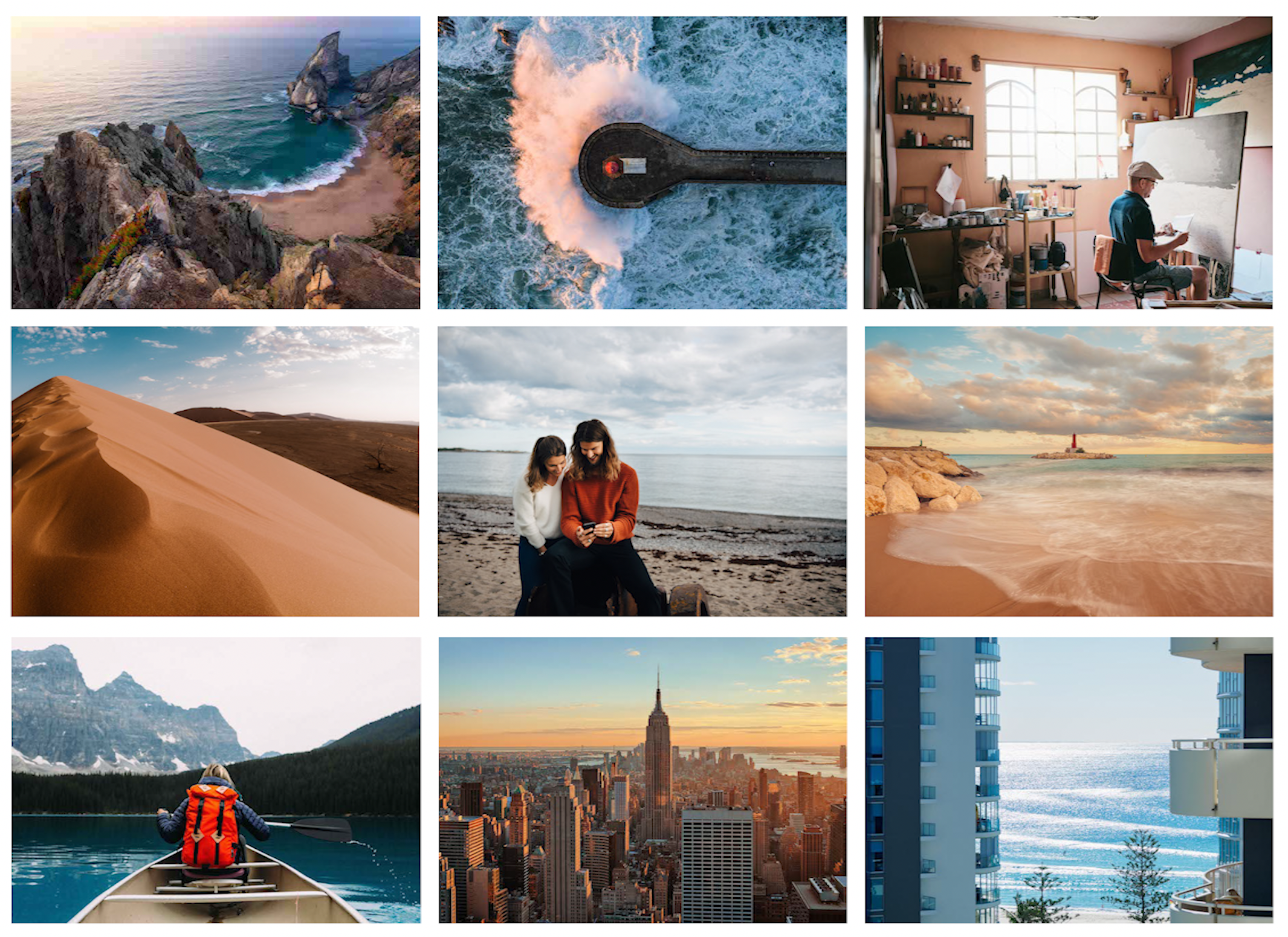
Orange & Teal
This is a folder of opposites attracting, the warmer orange and the cooler teal. These two colors put together create the perfect contrast, especially in nature settings. They have a great way of grabbing attention and often give people a good feeling as it reminds us of a sunny day, more specifically the golden sun and the blue sky. The great thing about both orange and teal is that you can color grade to adjust the chroma and value without harming the effect of the combination.
Muted
While the orange and teal combination can be bright and create excitement, this folder, comprised of a muted palette, takes on a more serious role. You might opt to choose a palette like this if you’re looking to appeal to a wider audience as it doesn’t feature any single color as a primary focus. A color scheme like this can create a very calm and relaxed mood for your followers, which is sometimes needed for those who have been scrolling for several minutes.
Natural & Clean
Our natural color theme depicts purity and serenity. The biggest strength of this palette is it’s lack of color and use of white space. In the design world, light colors, especially white, are known for creating space and opening up concepts. Using a color scheme like this for your social media can help make your feed seem more open and clean. Due to the light and toned down colors, these images are also great for when you want to add any text over a shot. If you’re a brand that loves using text in it’s images, this is the way to go.

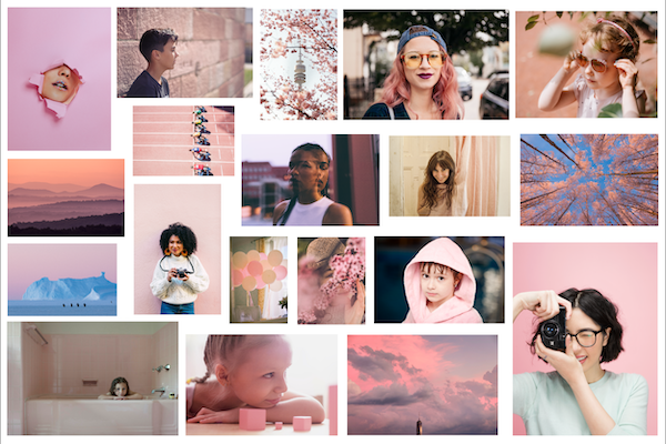
Millennial Pink
Millennial pink is a color that’s trending and can be found in florals, food, and fashion. Along with its popularity, it is also one of the most versatile colors. Why do we say versatile? Well because pink can be both very gentle but also vibrant depending on the chroma and value associated with it. Of course pink is most commonly known as a color that depicts femininity, used by brands such as Victoria Secret or Mary Kay. However, the value of the color can be changed to a darker level to appeal to other audiences. This is shown by companies like T-Mobile for example, who use a much darker shade of pink. The best thing about a pink color scheme is the pop, it can immediately enhance your social media feed and give your brand an energetic aura.
While these are some of the most popular color schemes out there, there’s still so many to choose from. If you’re still not sure what color is right for your brand, have a look at the best uses of color by some famous brands below to get inspired.
Color in Branding
Brands are maybe some of the most recognizable creations in the world. Sometimes you recognize the name, sometimes you recognize the logo, and there’s also a few brands which we recognize based solely on a color.
Tiffany & Co.
We’re all familiar with the famous blue box from Tiffany. Since their color has been set in stone, Tiffany has continued to grow with a brand identity simply related to one recognizable color. The turquoise shade emits a feeling of luxury and charm, which tells you everything about the brand.
McDonalds
The fast food giant is known all over the world for it’s red background and golden arches. Red and yellow are both warmer colors, which cause excitement, but excitement isn’t the only reason we pull over for a burger and fries. According to Readers Digest, red and yellow working together increases your appetite and makes you feel happy . These two things put together make you hungry and cause you to buy the product they sell.
Google is another brand that has an extremely recognizable color palette. They utilize red, yellow, blue, and green. Google’s color scheme may be the most diverse as it features 3 primary colors, which help it appeal to a wide range of users.
Conclusion
In the age of social media you are constantly posting and trying to get your message out. Colors have become an important tool in relaying these messages to audiences. Color schemes are universally appealing and have the ability to say a lot about you and your company, so it’s important for you to find the right one to represent your brand. We hope our color schemes come in handy, but if you’re still looking for something different then explore our full collection that features a range of colors to fit any brand’s needs.
Dissolve Premium (dissolve.com) has been the go-to for quality stock footage and photos by the world's top creative agencies and production houses. Some of the best filmmakers and stock producers from around the world are with Dissolve — our rapidly growing collection of unique, compelling footage is a testament to that. In addition to our quality stock footage and photography business, we launched Dissolve Creators (dissolve.com/creators/community). A platform for photographers, filmmakers, producers, and designers to connect and share their work as free downloadable content. We offer these creatives (amateur or pro) a bridge to our clientele, gig opportunities, networking opportunities, as well as our knowledge of the stock industry.
.png "sidebarassetDownloadV1 (1)")
.png "sidebarassetjoinV1 (1)")
.png "sidebarassetSocialV1 (1)")